Matter of Trust
Closing the gap between posting and confirming a donation
Matter of Trust's Hum Sum donation platform suffered from high abandonment during the donation process. Users posted their donation but never confirmed it. That meant no tax-deductible receipt, and no way for the organization to track contributions or prove impact to stakeholders. As the sole designer on the team, I originally hired as the graphic designer, I took on the Hum Sum website redesign when the founder identified the need.
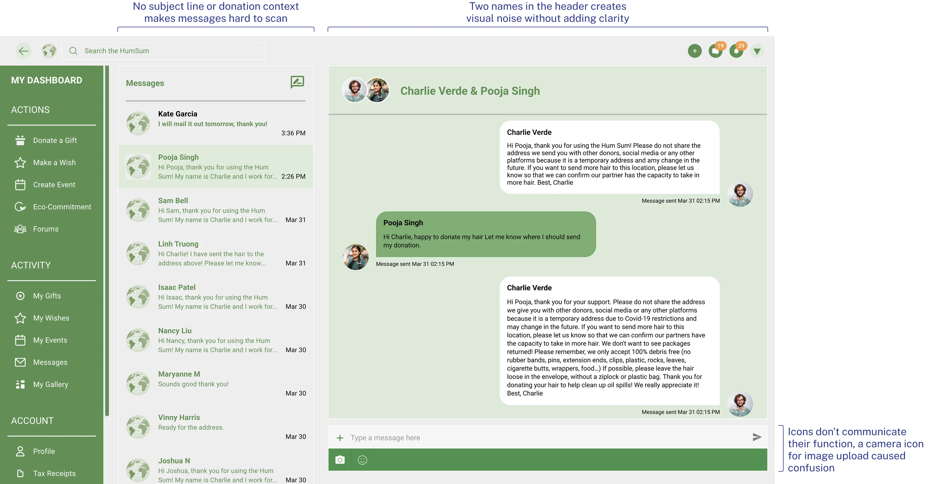
Problem
People didn't know confirmation was required
Users abandoned the donation process after posting their offer, unaware that a separate confirmation step was required to generate a tax-deductible receipt. This gap prevented Matter of Trust from tracking donations accurately, undermining their ability to document impact for grant applications and stakeholder reporting.

Key abandonment stages in the donation process
Solution
A unified communication and action pathway
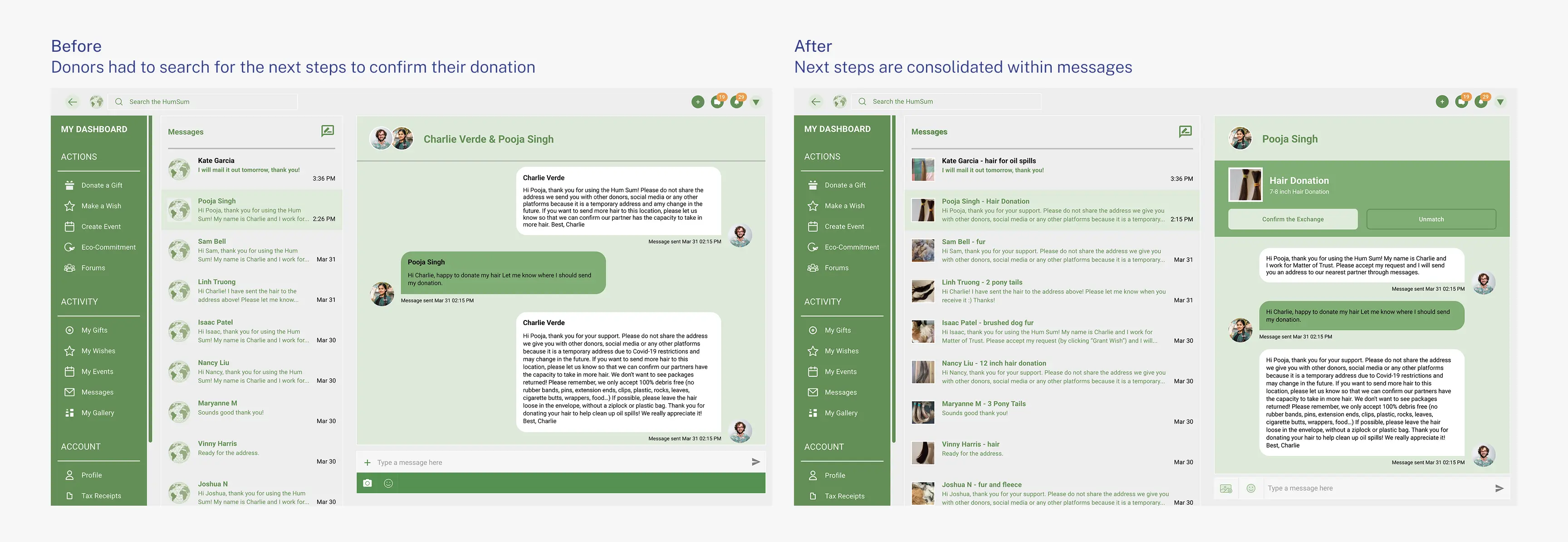
We embedded the confirmation action directly into message threads with a visually prominent call-to-action button, removing the need to navigate to a separate page. We also redesigned the platform's icon system, replacing unfamiliar symbols with literal ones, swapping a generic camera icon for an image upload icon, for example, so the interface communicated function at a glance.
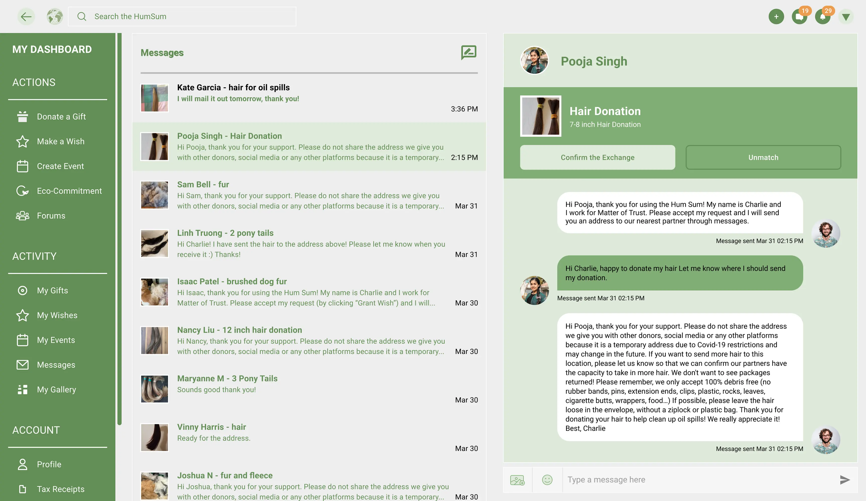
Confirm donations within messages
Research
A mental model disconnect
“I thought I had already donated when I posted my offer. I had no idea I needed to take another step to make it official.”
— User interview participant
Interviews revealed users believed posting their donation meant the donation was complete. The confirmation step that actually finalized it lived on a separate page, disconnected from the messaging system where nearly all user activity happened.
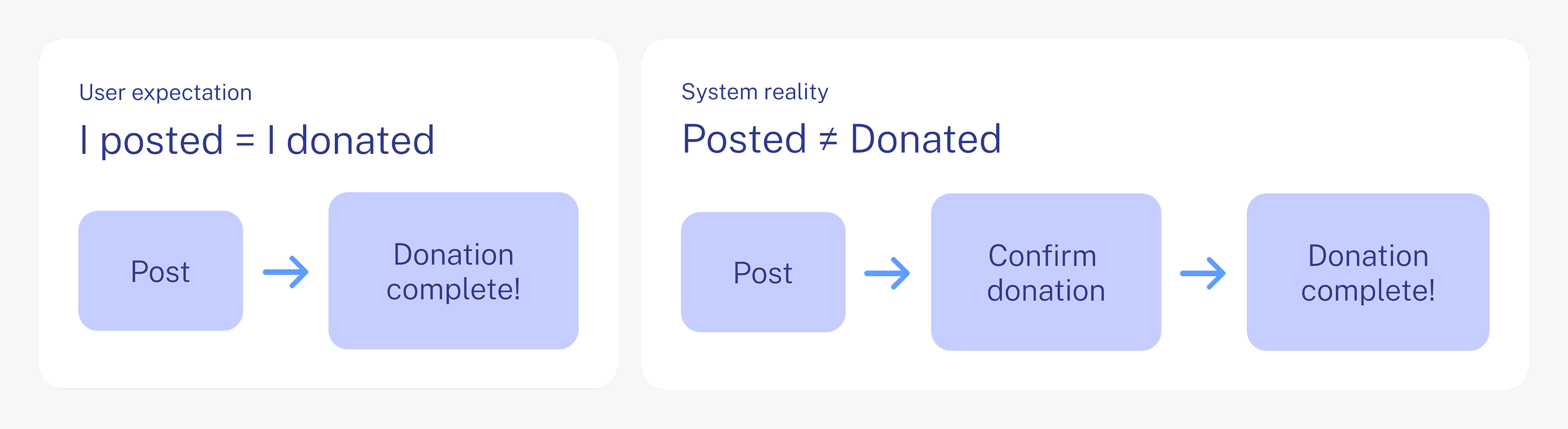
The mental model disconnect I discovered

Main pain points
Ideation
Centralizing actions where users already engage
The key insight was simple: the messaging interface was already where users spent most of their time, so it should also be where they completed donation actions. We explored designs that consolidated confirm, cancel, and review functions directly into conversation threads, drawing inspiration from familiar marketplace interfaces like Facebook Marketplace.
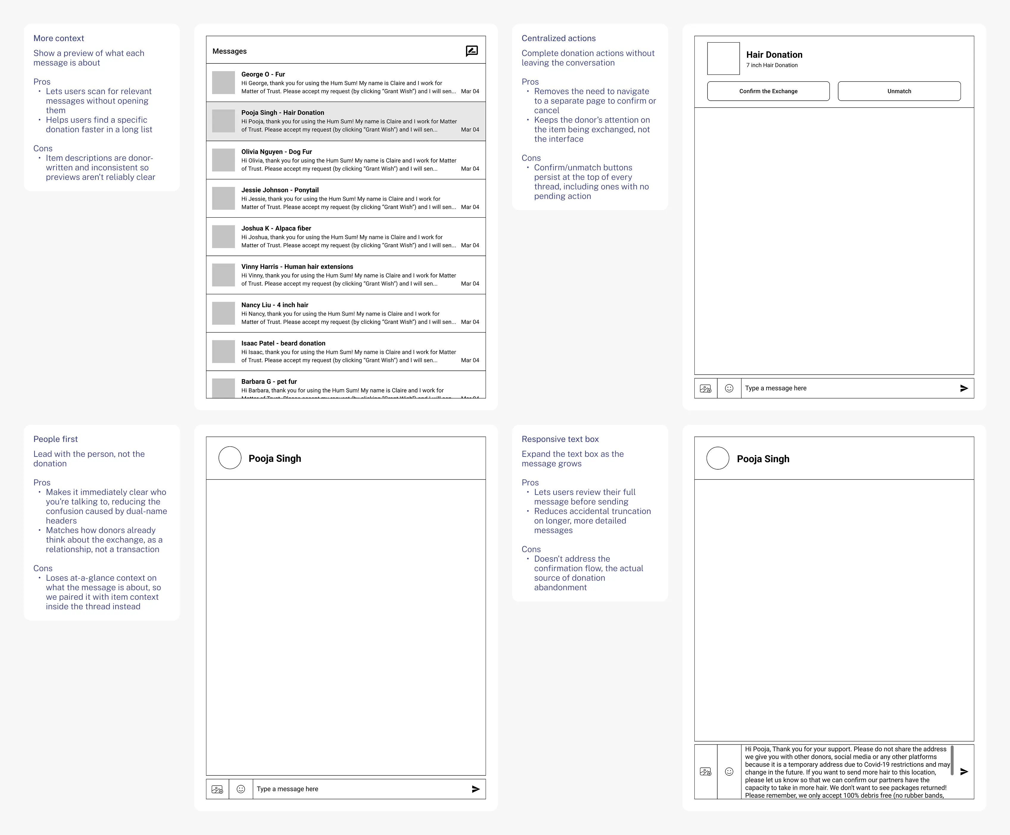
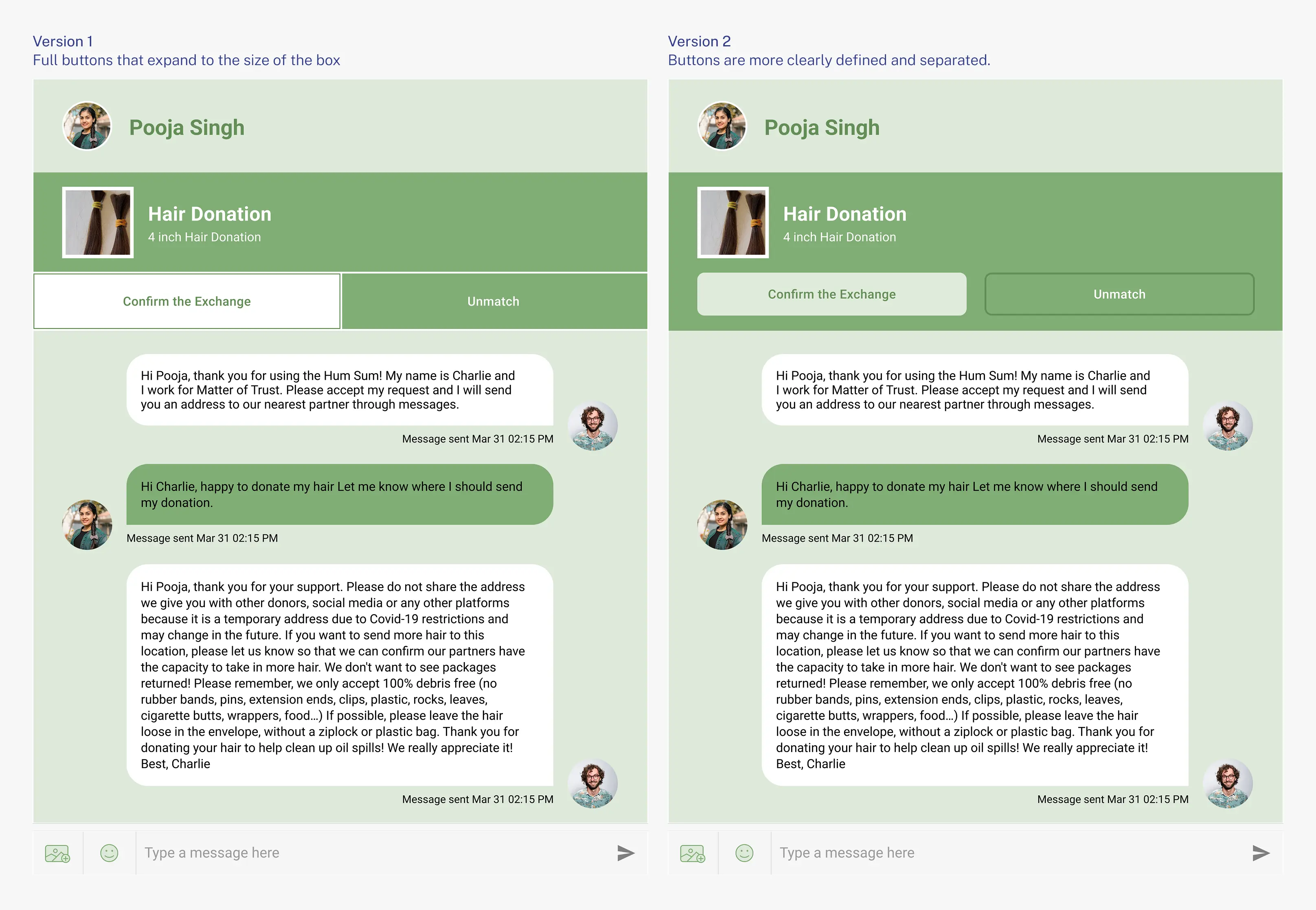
Centralized actions and a people-first header came first: testing showed users needed to know who they were talking to more than what they'd donated
Iteration
Refining through user feedback
We separated the buttons with clear spacing and contrast so each option read as its own tappable action.
Results and impact
A clearer path to completed donations
Usability testing with 6 participants showed the redesign addressed the core problem. 5 out of 6 said the new flow made it easier to complete the donation confirmation step, and participants consistently noted the consolidated messaging view felt faster and less confusing than the original separate-page flow.
Reflection
What I learned designing for trust
I learned how much a single small disconnect, a confirmation step hidden one page away, can undermine an entire donation system. Centralizing that action into messaging didn't just fix a navigation problem. It removed the moment where users assumed they were done when they weren't. If this project continued, the next step would be exploring automated reminders and more direct matching between donors and recipients.